S9PP : UI discussions
-
@Mff73
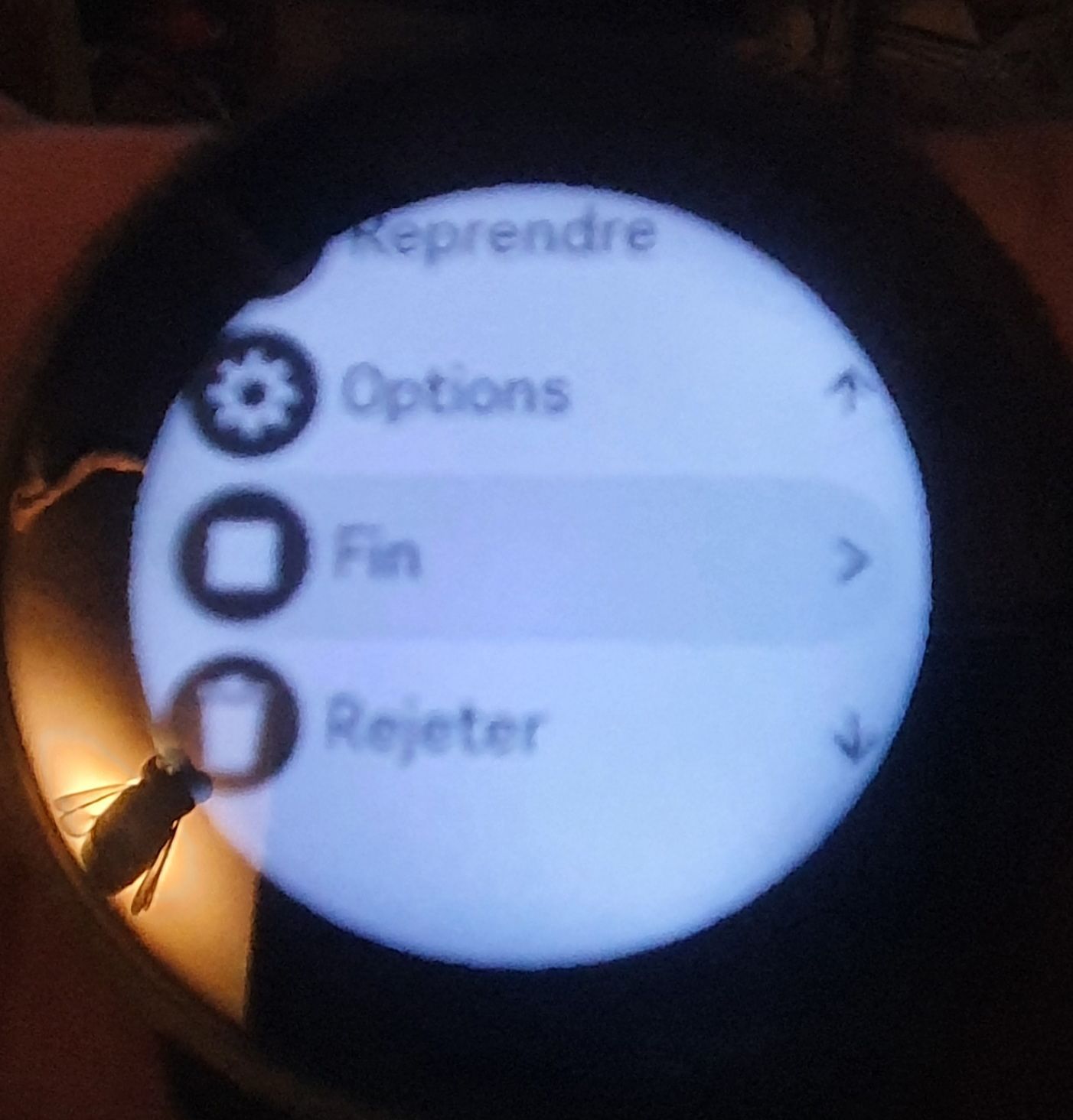
Imho it’s not wrong to have the delete option in this list. I’ve always found a bit annoying the fact I can’t delete an activity as soon as I terminate/pause it, in case of any kind of “false” start.It would be probably better to move the option “Stop” at the top, leaving “Delete” at the bottom
Just for the sake of conversation

-
@Mff73 Must say I don’t agree at all.
- Unpausing by mistake is seriously less problematic than ending by mistake; so it’s good that the first item is not “end” but “start again”.
- There is a warning if you click “discard” by mistake. Good enough to avoid discarding by mistake
- One fewer click to end the workout (by far more users will be wanting to end than they click “end” by mistake, also due to #1 above) is much, much better for usability.
-
@Spree said in S9PP : UI discussions:
@Mff73 Must say I don’t agree at all.
- Unpausing by mistake is seriously less problematic than ending by mistake; so it’s good that the first item is not “end” but “start again”.
- There is a warning if you click “discard” by mistake. Good enough to avoid discarding by mistake
- One fewer click to end the workout (by far more users will be wanting to end than they click “end” by mistake, also due to #1 above) is much, much better for usability.
ok with your disagreement
")
1- i fully agree with first position of “resume” / “start again” (i didn’t speak about this one ). In fact, i was arguing “against” having “rejecting” option in this very first pausing screen (at the opposite of what @sartoric said)
2- agree also that warning message is good, and enough to avoid discarding by mistake. I was more thinking that such a confirmation message should also be there for ending the activity.
3- not sure to understand your point : do you mean you would vote for an extra confirmation screen for ending the activity ?
i was “just” saying to have “END” activity at the bottom of the list, because the UI touchscreen is so fast that an energic scroll down gesture ends so easily and quickly to the bottom, which is now “reject”.
-
@Mff73 I misunderstood most of your post then :).
I though you wanted an extra button to confirm the end of the activity
-
@Spree
maybe my post(s) was(were) not that clear
i would personnaly prefer :
1- not having “reject” in this screen, or not at the bottom of the list (for touchscreen usage)
2- having the “end” choice, at the bottom of the list (for touchscreen usage)
3- and yes, i would vote for an extra button click (confirmation) to end an activity.When i say “for touchscreen usage”, i understand that having “end” choice at the bottom, would lead to an extra click for button usage.
-
@Mff73 Clearer now.
1-Uncertain. I understand your point, but I find it nice to be able to reject without saving.
2-Position wise, this is possibly a good idea due to the “scroll factor”.
3-Nah, one fewer click is better :). -
I think a better UX choice would be to have the reject option moved after the end option : when you choose to end, you have the options :
- end and record
- come back (on the same button you had to click to end, so fast clicking will essentially do nothing)
- end and discard (with a confirmation in this case)
-
@martin
it would make the structure deeper.
due to the confirmation after discarding we are safer in case pressing the wrong button -
I like the UI as it is. Makes sense to me and everything does need confirmation in a way.
-
@Mff73 There is another warning after you select discard before the activity is trashed so it is not easy to trash it.
Hello! It looks like you're interested in this conversation, but you don't have an account yet.
Getting fed up of having to scroll through the same posts each visit? When you register for an account, you'll always come back to exactly where you were before, and choose to be notified of new replies (either via email, or push notification). You'll also be able to save bookmarks and upvote posts to show your appreciation to other community members.
With your input, this post could be even better 💗
Register Login