S9PP review from a non-target audience
-
@A Former User said in S9PP review from a non-target audience:
Design
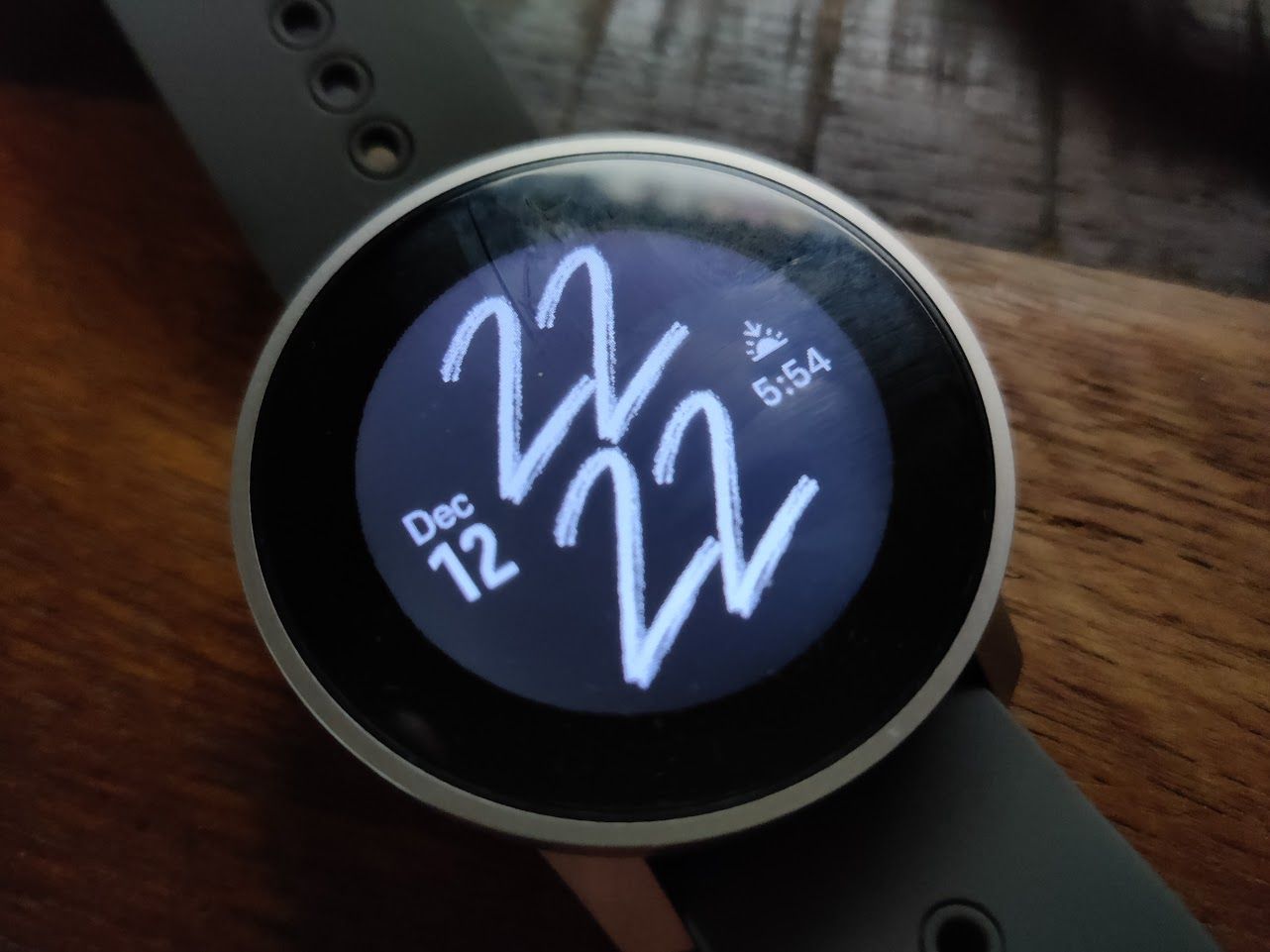
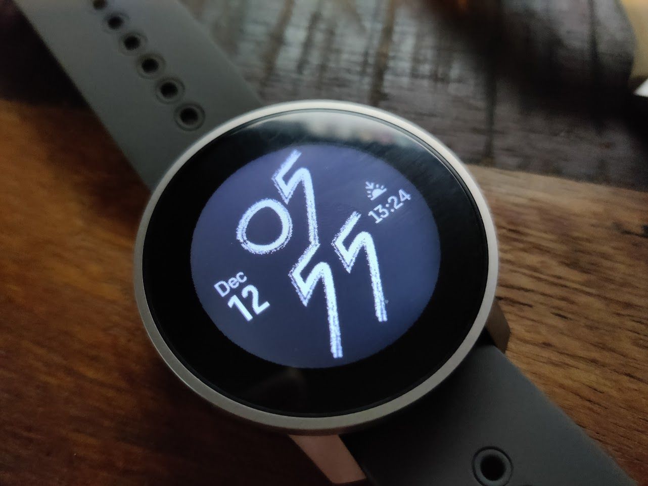
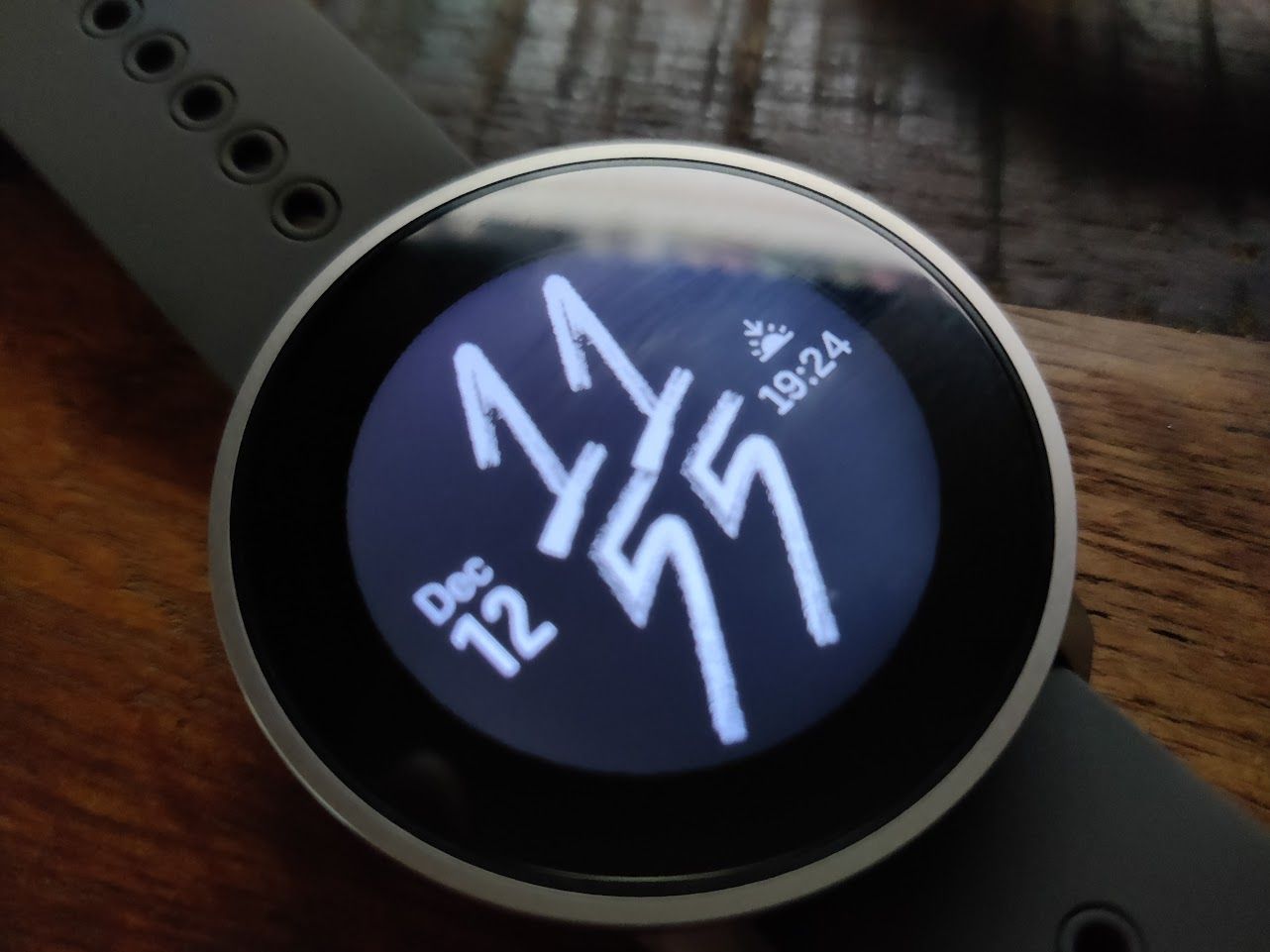
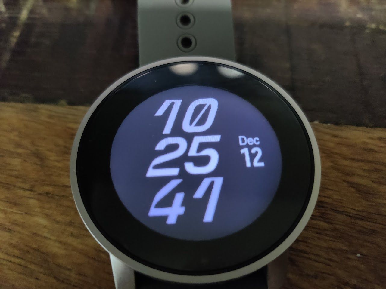
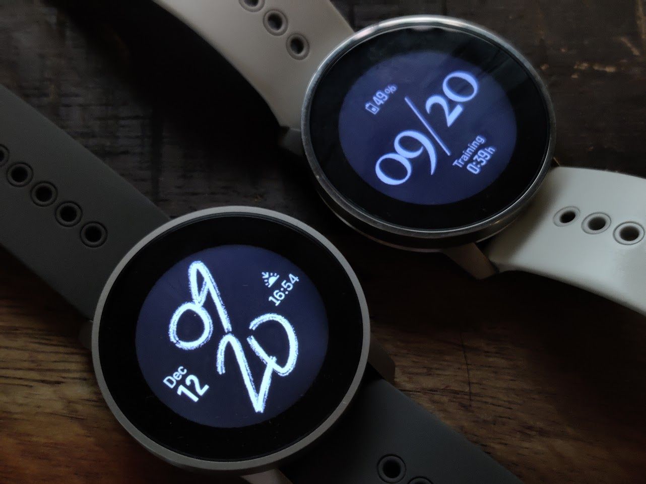
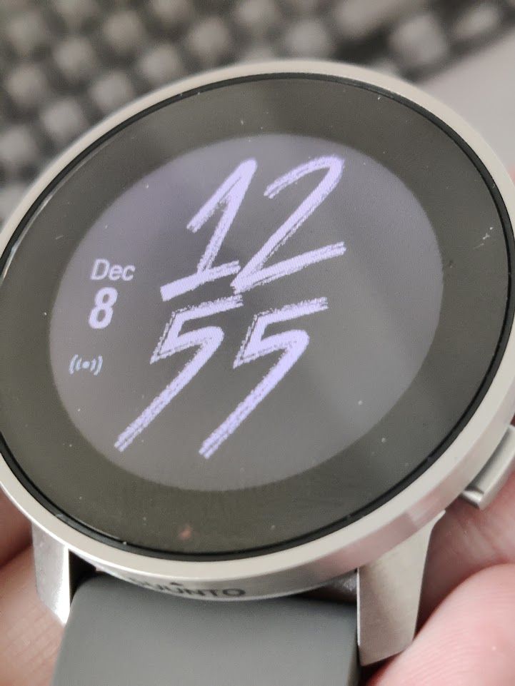
looks more as toy or watch from automates for 5eur…BEZEL is huge and irrational, no sense at all…(well it would have sense if they as GARMIN used this huge BEZEL for solar cells…but NO) and they are covering 25%-30% of displays for FUN
I know bezel talk has been done to death, but it’s something I do consider when buying a watch. The comical size of the FR 935 and 945 bezels are one reason I didn’t upgrade to them back when I was with Garmin and instead came to Suunto with the 9 Baro (proportionally a smaller bezel-to-screen size ratio).
Now that I’m wearing a 9PP, I’ve surprised myself at how much I’m not bothered by the bezel in person. It looks worse in photos than it does in real life. My only wish would be for Suunto to have put their logo on the bottom part of the bezel rather than on the side of the case. I think that would’ve looked sharp.
-
@TrailEyes said in S9PP review from a non-target audience:
Suunto to have put their logo on the bottom part of the bezel rather than on the side of the case
Funny enough, I remember quite a bit criticism of the logo being put on the front of s9b.
-
@DMytro I suspect on the 9B, the unhappiness there was because it was done in a way to use up a bit of screen display real estate, so the top-to-bottom proportions were shorter than the left-to-right ones. I think there’s enough bezel on the 9PP to put the logo on the face without infringing on the display.
-
@Umer-Javed said in S9PP review from a non-target audience:
I feel there’s a bit more to it here. I upgraded to S9PP from an A3P as well. Can you guarantee that your compass was accurate through that year?
yes, using it at least 4 times a week, always came to destination
@Umer-Javed said in S9PP review from a non-target audience:
I also prefer not to have touchscreen for “critical” actions like these. I intend to use wear this ice climbing and skiing with gloves and in wet conditions, so a button for those items is definitely better.
critical action is to start a training over display instead button??? wtf :)) well :))) I hope you take care more serious your own security and you don’t play with watch buttons during a climb…but hey you will not believe, I start my training before I really start my training, and since I don’t do climbing, I would like to use touch display for that functionality, simple like that
@Umer-Javed said in S9PP review from a non-target audience:
Re: durability, it’s passed MIL-STD 810G so I feel OK
they can write what ever, imagination is for free as well a believe
@Umer-Javed said in S9PP review from a non-target audience:
I’ve been wearing mine 24/7 since I received it late October (except for a few days when i was sick…) and mine has no such issues
that does not help at all
-
@TrailEyes said in S9PP review from a non-target audience:
I know bezel talk has been done to death
well, lets see if I will adjust to that next days/weeks , at moment it just hurts my eyes
-
@A Former User said in S9PP review from a non-target audience:
critical action is to start a training over display instead button???
The middle button is also used to switch screens in activity. When using gloves or having wet hands, using touch screen is problematic.
-
@DMytro said in S9PP review from a non-target audience:
The middle button is also used to switch screens in activity. When using gloves or having wet hands, using touch screen is problematic.
sure, this is not a problem ,and I do understand it… however… if we do “need” to accept double functionality on music,options,etc…why would be a problem to have this …for us who train in dry conditions?
Or at least or additionally they could remap upper key (one key to start,pause,stop) instead of menu, deleting a log is already available under logs, this is also duplication
ahh…new thing, Timer Alarm (not checked wake up alarm) is so silent that I need really to bring the watch near to my ears to hear it…and I am not so old (I guess)
-
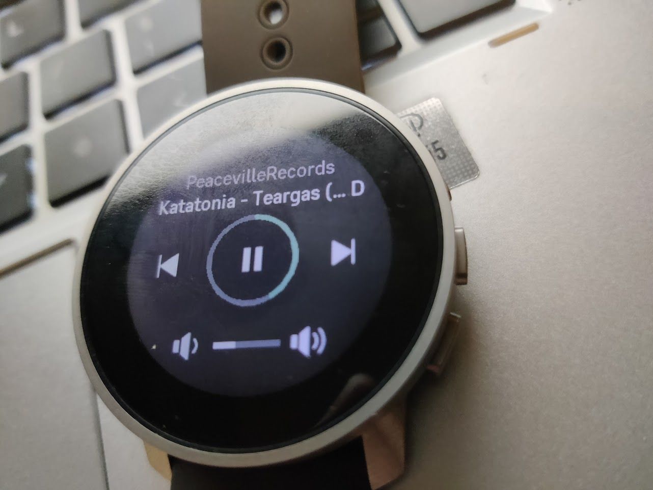
I used the fantastic media controls today,
when I see this UI, I thought the middle button, which is close the NEXT icon, will be used to swtich music.
Guess what, the middle button is the only button which does nothing…
-
@A Former User said in S9PP review from a non-target audience:
@DMytro said in S9PP review from a non-target audience:
The middle button is also used to switch screens in activity. When using gloves or having wet hands, using touch screen is problematic.
sure, this is not a problem ,and I do understand it… however… if we do “need” to accept double functionality on music,options,etc…why would be a problem to have this …for us who train in dry conditions?
Or at least or additionally they could remap upper key (one key to start,pause,stop) instead of menu, deleting a log is already available under logs, this is also duplication
ahh…new thing, Timer Alarm (not checked wake up alarm) is so silent that I need really to bring the watch near to my ears to hear it…and I am not so old (I guess)
Security is perspective, I think the good way is to create a setting to enable/disable touch screen for sport.
Security is very perspective, my ex girl’s safeword was schneckenkuchen, I’m almost dead about hundreds times. - it’s not safe at all!
-
It looks like it’s the post to bash the s9pp.
My only problem with this watch is that there no new shiny flashy stuff. I had a s9b, it’s the same but smaller. And with a longer battery life (that’s the real new thing for me).
But that’s what we want, no ? We go to the menu, two or three buttons press later, you start your run or whatever session.
You end your session and 20 seconds later it’s on the phone, 1 minute later it’s on Strava.
I dont care about the little detail and you should not care too, it’s “just” a thing to track some numbers. And I think this watch is really good for this, especially since you need to charge the watch every two or three weeks.
ps : I run sometime in Montsouris, watch your left !

-
@Kowalski said in S9PP review from a non-target audience:
It looks like it’s the post to bash the s9pp.
My only problem with this watch is that there no new shiny flashy stuff. I had a s9b, it’s the same but smaller. And with a longer battery life (that’s the real new thing for me).
But that’s what we want, no ? We go to the menu, two or three buttons press later, you start your run or whatever session.
You end your session and 20 seconds later it’s on the phone, 1 minute later it’s on Strava.
I dont care about the little detail and you should not care too, it’s “just” a thing to track some numbers. And I think this watch is really good for this, especially since you need to charge the watch every two or three weeks.
ps : I run sometime in Montsouris, watch your left !

nono, you don’t understand what I’m talk about,
no no, S9pp is totally different than S9B, it’s not only smaller, longer battery life.
and no, it’s not a problem with just more click on button, it’s a perspective from a user who changed his watch regular.
If you only want track some thing, use your phone.
And I don’t run in montsouris… there are too many rats…real rats…
-
@Kowalski said in S9PP review from a non-target audience:
It looks like it’s the post to bash the s9pp.
I wanted to comment something very similar but would have been using the word rant…
you’re absolutely right, I have the same use case and of course enjoy a nice piece of time device on my wrist

-
You use this watch as a daily, like a Galaxy watch or Apple watch ?
You are right, I don’t think the watch can compete, the only positive point are the battery life and maybe the robustness.
While I personally prefer the minimalist approach, every “smartwatch” functionality are basic. Message on watch, media control, etc, it’s here, but it’s not done for this, it’s a watch for outdoor activity, the interface is designed around this. I am tired after 30km and running, I can easily navigate. I navigate the menu while surfing, not problem. Kayak, paddle, whatever, the watch is reliable, that’s what we whant.
It’s like comparing a pickup and a Prius. None is better, just not designed with the same purpose in mind.
I agree about Montsouris and Paris in general, I avoid the region at all cost personnaly.
-
@Kowalski said in S9PP review from a non-target audience:
You use this watch as a daily, like a Galaxy watch or Apple watch ?
You are right, I don’t think the watch can compete, the only positive point are the battery life and maybe the robustness.
While I personally prefer the minimalist approach, every “smartwatch” functionality are basic. Message on watch, media control, etc, it’s here, but it’s not done for this, it’s a watch for outdoor activity, the interface is designed around this. I am tired after 30km and running, I can easily navigate. I navigate the menu while surfing, not problem. Kayak, paddle, whatever, the watch is reliable, that’s what we whant.
It’s like comparing a pickup and a Prius. None is better, just not designed with the same purpose in mind.
I agree about Montsouris and Paris in general, I avoid the region at all cost personnaly.
I don’t understand, are we talk about s9b or s9pp?
-
@freeheeler said in S9PP review from a non-target audience:
@Kowalski said in S9PP review from a non-target audience:
It looks like it’s the post to bash the s9pp.
I wanted to comment something very similar but would have been using the word rant…
you’re absolutely right, I have the same use case and of course enjoy a nice piece of time device on my wrist

Ok which watch on your wrist? S9pp or?
-
@zhang965
it depends -
-
@zhang965

day, time, sport, mood… -
I have an old seamaster, for the same reason I use a Suunto, it’s reliable, robust and I don’t care about connected feature if I’m not in an activity.
I had S9B, S9P and S9PP, they are all the same for me. Same menu, same everything. I dont care about watchface, especially the new one, I like simplicity and readability.
Sometime I see people debating small details with too much passion. It’s a smartwatch, people should not overthink it.
Discuss it, ok, that’s why we are here, but ranting about small details, that’s not ok, people should take a step back and think. Is a watchface font really important ? Two misplaced pixels are really a problem ? -
@Kowalski said in S9PP review from a non-target audience:
I have an old seamaster, for the same reason I use a Suunto, it’s reliable, robust and I don’t care about connected feature if I’m not in an activity.
I had S9B, S9P and S9PP, they are all the same for me. Same menu, same everything. I dont care about watchface, especially the new one, I like simplicity and readability.
Sometime I see people debating small details with too much passion. It’s a smartwatch, people should not overthink it.
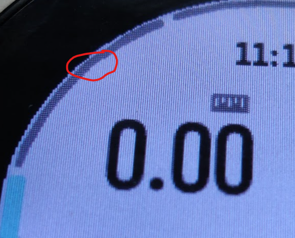
Discuss it, ok, that’s why we are here, but ranting about small details, that’s not ok, people should take a step back and think. Is a watchface font really important ? Two misplaced pixels are really a problem ?Lol, if you think people overthinking about it, why you debate with me. Your débat is really important? Your Omega is really important?
It’s time to get bed, tomorrow you still need to run at Montsouris with some funny furry animals.
