Where is training load?
-
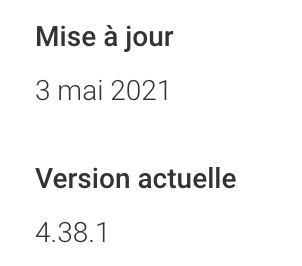
@nigel-taylor-0 The actual version is 4.38.1 on play store

-
Stable versions for both iOS and Android have been published, but Google manages releases on their own. So at some point it will offer the updates. I have Android 4.40 since few days already.
-
@isazi said in Where is training load?:
Stable versions for both iOS and Android have been published, but Google manages releases on their own. So at some point it will offer the updates. I have Android 4.40 since few days already.
only 4.39.1 beta here

-
@mff73 me too
-
@isazi said in Where is training load?:
I have Android 4.40 since few days already.
Why don’t we have this 4.40? Not a beta?
-
@jihaisse said in Where is training load?:
@nigel-taylor-0 The actual version is 4.38.1 on play store

For me that is only visible if browsing the store via the Web (and unable to push the Install from the link, as it knows I already have the app).
On my Phone Play Store, still only the version from 30th of March is available, despite some apps with update dates of 6th and 7th of May being pushed to me today

-
Finally got it!
Quite like the new widgets, although they don’t seem to scale particularly well and I need a dark or transparent option!
Also, seems a bit odd that clicking the widget doesn’t take you straight to the appropriate focus inside the app.
CTL/ATL seems to match pretty closely with TrainingPeaks (I expect some difference as I merge Power data into my runs after uploading) - now if only we could plan future workouts and build training plans to drop in place etc I could stop paying for TP!
-
@nigel-taylor-0 they are scalable in the next version (the current beta we have).
As of transparency, its not easy with this layout. Perhaps in another iteration.
-
Widget on phone home screen takes you to the widgets in the app. pressing on the widgets in the app of course takes you to the correct place.
not sure if I don’t prefer this to the other route as don’t have to put all the widgets out, just one or two you are interested in, but pressing takes you to all of them i.e.rather than taking direct to data.and then having to go back to home screen. Maybe should go to data (ie… today screen, steps etc) and there should be like a home widget i.e. one with a smaller picture, but holds all the widgets? -
@jamie-bg I am also used now to take me in the app, so I removed my Suunto icon from the launcher.
-
@isazi said in Where is training load?:
Stable versions for both iOS and Android have been published, but Google manages releases on their own. So at some point it will offer the updates. I have Android 4.40 since few days already.
4.39.1 still here

-
@dimitrios-kanellopoulos said in Where is training load?:
@nigel-taylor-0 they are scalable in the next version (the current beta we have).
As of transparency, its not easy with this layout. Perhaps in another iteration.
Good to hear on scaling, I guess the Samsung OneUI does some kind of force scale of widgets that aren’t designed to?
Maybe dark and light backgrounds would be an interim step towards making something that works and remains visible well with transparency?
-
@flypg but 4.40.0 === 4.39.1, right?
-
@suzzlo Mmm… FALSE

4.39.1 === 4.39.1
TRUE, Or I’m wrong?

-
@flypg LOL
I mean, 4.39.1 is the last beta that have been released has 4.40 in stable channel…
-
@suzzlo
 Now I catch it. We need to wait on this case, but it’s amazing the time that takes to arrive to our devices.
 -
@jamie-bg said in Where is training load?:
Widget on phone home screen takes you to the widgets in the app. pressing on the widgets in the app of course takes you to the correct place.
not sure if I don’t prefer this to the other route as don’t have to put all the widgets out, just one or two you are interested in, but pressing takes you to all of them i.e.rather than taking direct to data.and then having to go back to home screen. Maybe should go to data (ie… today screen, steps etc) and there should be like a home widget i.e. one with a smaller picture, but holds all the widgets?I can’t really follow what you’ve written, but for me, if I choose ANY of the widgets, clicking them on my phone screen takes me straight to the Home Screen of the app.
Preferably the ‘Progress’ widget should take you to Diary/Progress’, the Resources should take you to ‘Today’, Sleep should take you to Diary/Sleep etc etc.
Also - can we get a Watch Tile showing CTL/ATL and Form please.
-
I’ve only just noticed, but on the HOME page in the phone app there’s now a couple of extra swipable defaults in the top bit of the screen.
Screen 2 on there as default kind of gives me what I want…if I click from a Widget I see the similar Widget display ‘in the app’ - and can then click directly to what I’m interested in, rather than remembering to click Diary and then Progress etc.

The ‘Progress’ info really should be a Tile on the Watch though, every other data here is accessible from a Tile.
-
@nigel-taylor-0
progress - unlikely to have it as a tile on the watch, as its all done via the servers.
Would be quite nice if all of those widgets were available as tiles on the S7. -
@jamie-bg that is correct. No title on the watch since its server side