*about iOS 1.8.1(6998)
-
Apart of that Suunto guys stuck by adding options
 I would like to see the elev loss option soon. What can i do with watts…
Guys what data fields do you want to see in configurable options?? -
Any improvement for A3F? I have not noticed any since 01/2019…
-
Good things and not so good!
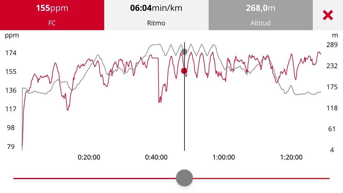
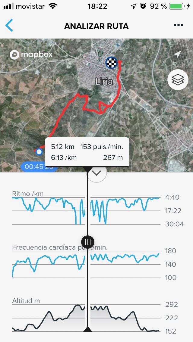
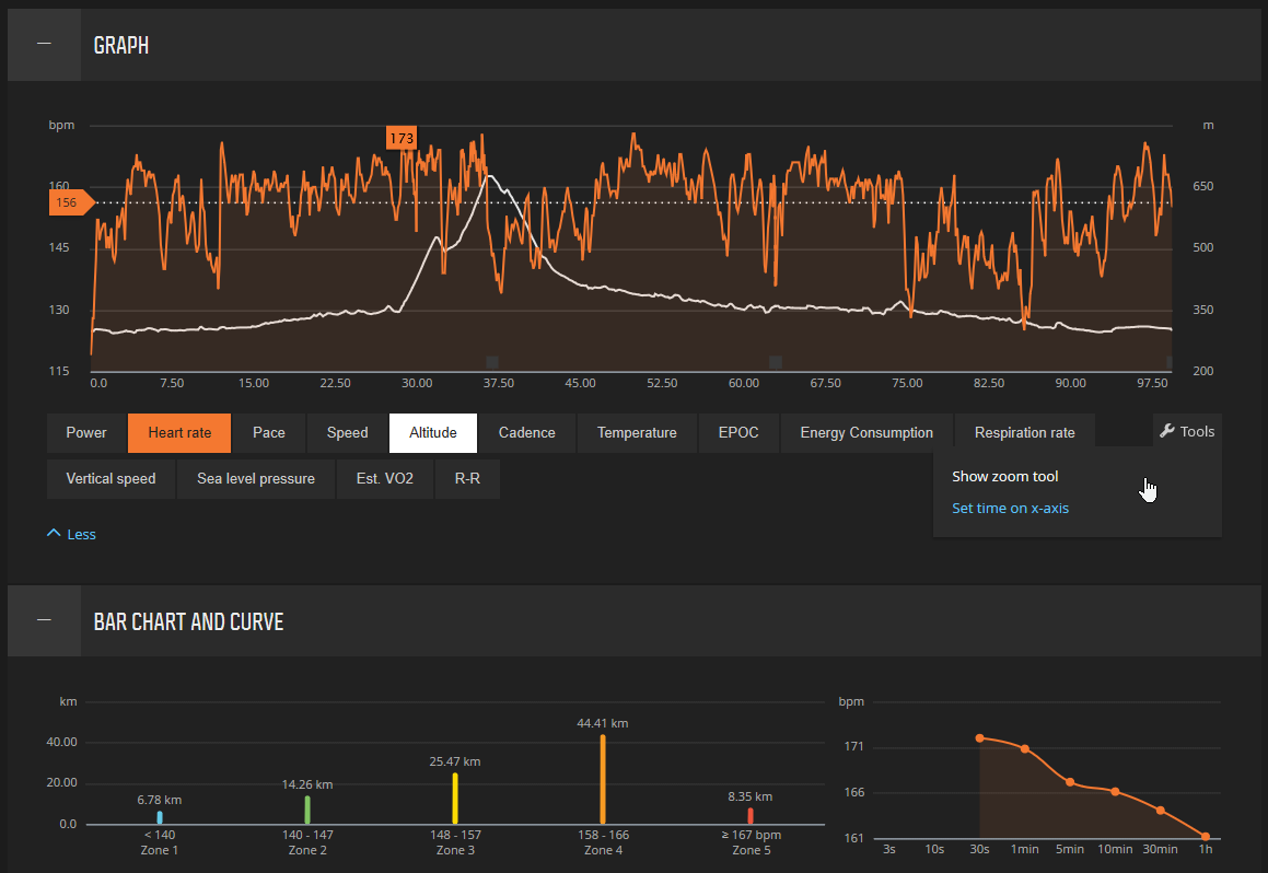
Suunto app performance is becoming more and more complete every day. I think it’s time to start applying improvements to design aspects?? Graph smothing is horrible and infantile. It looks like an entertainment app for kids 3-8. A fabulous example of graph aspects that this app should have we can see in neighborhoods app. Requires landscape mode implementation etc. and for more entertainment can have some zoom options.

Vs

-
@valdis830 have you see the android charts ?
-
Aftet the laps the new charts etc is next to come. And the descent.
-
@Dimitrios-Kanellopoulos No, I have not seen them. Are they better than iOS? 2 different apps that always go each a different way hahaha
-
@valdis830 yup
-
@Dimitrios-Kanellopoulos I’m confused, for android first laps and then charts? I understood from other thread that I will be charts and then laps…
Anyway, waiting 6 more days, since Wednesday it’s usually release day, or I’m wrong?
-
@suzzlo hmmm android has already some big chart improvements (beta and prod) did you try tapping on them . ? Laps later on Android . Did you try landscape on workout details?
So iOS got first laps and Android got first charts. Both of those features are and will be improved. That means that the descent that @valdis830 asks for will be there , extra swim stats, new chart library for Android (charts are already improved see above but libraries/visuals will go further) .
Hopes this makes sense.
-
@Dimitrios-Kanellopoulos
Boom!! there is already landscape, with zoom, good!Yes, makes sense.
Some comments about graphs
- Love, zoom. Double tap to reset?
- Zones in graphs. In the FR graph, I can see some horizontal lines. Would be great if these lines colors help distinguish these zones (perhaps adding zone color will help). Same for, Pace graph, Power graph, Speed graph…
- Long press -> save selected area as an image. Would be very very useful (sure some users will pay you a beer now for that feature), and perhaps the library has an option for that, and you don’t need to implement it.
- Simple tap -> vertical line appear with point info (example “155”). More info could be added: exact moment, zone color…
- Graphs are based on time but could be based on distance
heh, found a transition when you press “Show in Map”!!

(and I stop here since it’s an iOS thread and it’s a bit out of my scope)
-
@suzzlo lets create a new thread on this
 and lets see what some updates will bring. This was the least we could do at the moment but our foucs is to improve those and for that the discussion is most welcome
-
@Dimitrios-Kanellopoulos perfect!
-
@suzzlo in this version there is a possibility to configure or to create a multisport sport mode like a duathlon? (Run-T1-bike-T2-run) or a simple multi sport mode with transition? Now when I have a duathlon race I start a run sport mode, press and hold up-right start stop button when I am in T1 and select bike sport mode when I exit from transition zone, but all this is not simple or user friendly during a race.
-
Unfortunately, I don’t think so, because there is no ‘transition’ sport
Multisporters, Any idea?
-
@Dimitrios-Kanellopoulos said in *about iOS 1.8.1(6998):
android has already some big chart improvements
What kind of improvements? I don’t see any other than landscape more. Graps still have non-linear x-axis, fake spikes on pace graph, and bogus fixed range (2:00/mile to 14:00/mile) on pace graph. Furthermore looking at any given graph alone in landscape mode has little value. Graphs are only useful when one can look at multiple metrics together, for example pace vs. HR or pace vs. altitude.
-
@silentvoyager you can click on the charts and you have full screen. The scale of course is linear now, its segmented into 4 parts. What is the issue exactly ?
-
@Dimitrios-Kanellopoulos I suggest a copy of the graphs display from Movescount, that was very useful and actually showed something rather than a single metric being displayed in graph mode.

-
@suzzlo I’m a triathlete and I want to see how much time I spend between enter and exit in transition area. When I go to do a triathlon race the “triathlon sport mode” is ok, but when I go to do a duathlon race I lose this data.
-
@nunziobonanno I agree with you. I want to have this option, but actually there is not.
Just an idea:
Create new sport mode based on ‘others’ or ‘crossfit’ or any other not based in GPS, and use as ‘transition’
Then start your race- Bike
- Use multisport feature (long press of upper button let you change sport) to change to ‘transition’
- Run
- Use multisport feature (long press of upper button let you change sport) to change to ‘transition’
- Bike
- …
Makes sense to you?
-
@Dimitrios-Kanellopoulos said in *about iOS 1.8.1(6998):
@silentvoyager you can click on the charts and you have full screen. The scale of course is linear now, its segmented into 4 parts. What is the issue exactly ?
The HR graph has linear x-axis scale but Altitute / Pace / Speed charts continue to be non-linear. For example, here are time labels from a graph from a recent long run (when in full-screen mode):
0, 46:17, 1:33:53, 2:22:25, 2:58:10, 3:27:47, 4:00:26, 4:48:06.
As you can see the delta between labels varies from 29 minutes to 48 minutes.
My current version is 3.64.2, so perhaps that isn’t the last version, but I am in the beta program and there are no new updates available to me.