Minimal watchface (feedback)
-
I’m finding the battery consumption of the watch is higher than it should. I think, one of the reasons is I have been toying with the watchfaces.
While complications are nice, I’m more old school. I find several issues:
-
Grey color accent is missing. In my opinion, this is probably the most important color. It means the screen is not so bright while you are at home (so it’s more comfortable) but you are also saving battery.
-
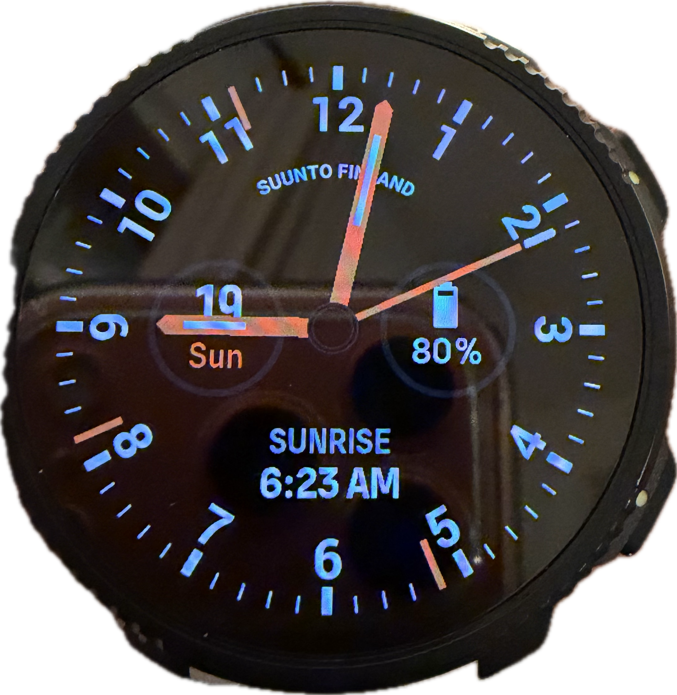
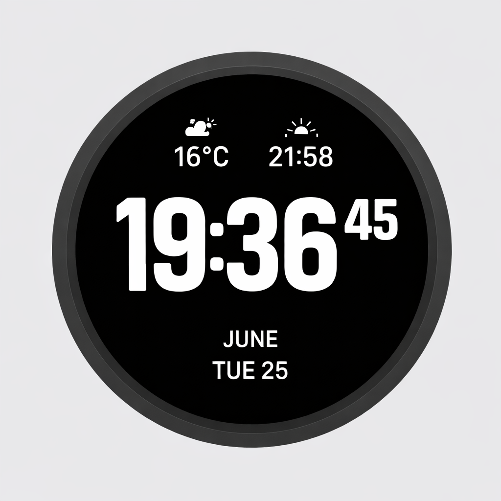
I miss a minimal wachface default design (Date, time and battery icon. Nothing more). The most similar is the Vertical 1 but the white is too bright (since grey cannot be set) and it does not have a tiny battery icon.
Does somebody remember the old Garmin Forerunner 935 watchface? I find the battery icon important because it means I will never forget to charge the watch before a run. It’s an small detail but that is the main reason of having that icon historically by default in Garmin.
Suunto Vertical 2 Titanium Sage, Suunto Run
-
-
There are several minimalist watchfaces and a few of them you can modify the complications. I like the K-14.
-
@dreamer_ Or this one, “Modern Analog”
-
Thanks mates. I think the K-14 while not digital , does somehow the job.
I’ll try both")
I’d love the grey accent though
Suunto Vertical 2 Titanium Sage, Suunto Run
-
@dreamer_ My watch face preferences haven’t changed much since I switched to the Vertical 2; I still prefer “Athlecis” when exercising, “Stride” or “Classic Analog” with a suit, and of course, a leather strap.
-
@dreamer_ said in Minimal watchface (feedback):
K-14 while not digital , does somehow the job
If you prefer digital, you can try “Ocean”
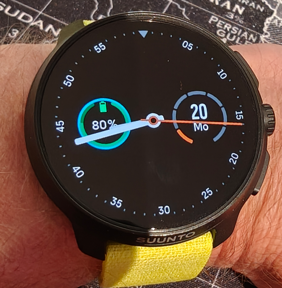
You can disable outer analog complication, to have only time, date and battery.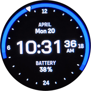
Full / Display only
-
@Squirrel thank you so much!! After removing the compilation this is nearly perfect. Font is a bit small but It is exactly what I was looking for. Simple and functional.
There’s another one, “simplicity analog” that is very good too but the Ocean one is almost perfect.
-
@dreamer_ i like the vertical watchface. but maybe with other fonts (from race 2).
like this? or with one more compilation.
-
@kevin the thing is that the Vertical 1 watchface is very good in a MIP panel because the fonts are greyed (less intrusive).
But now we have a super bright (and very nice) amoled screen.
I think the almost perfect match is the Ocean watchface after removing the outer compilation. The other compilation leyends in this watchface are also grey by default. So it’s almost perfect. Battery saver, with everything I need, and not intrusive.
Thank you so much guys.
-
@dreamer_ similar to Ocean is Outdoor.
Just with a battery symbol instead of the text and a little larger font: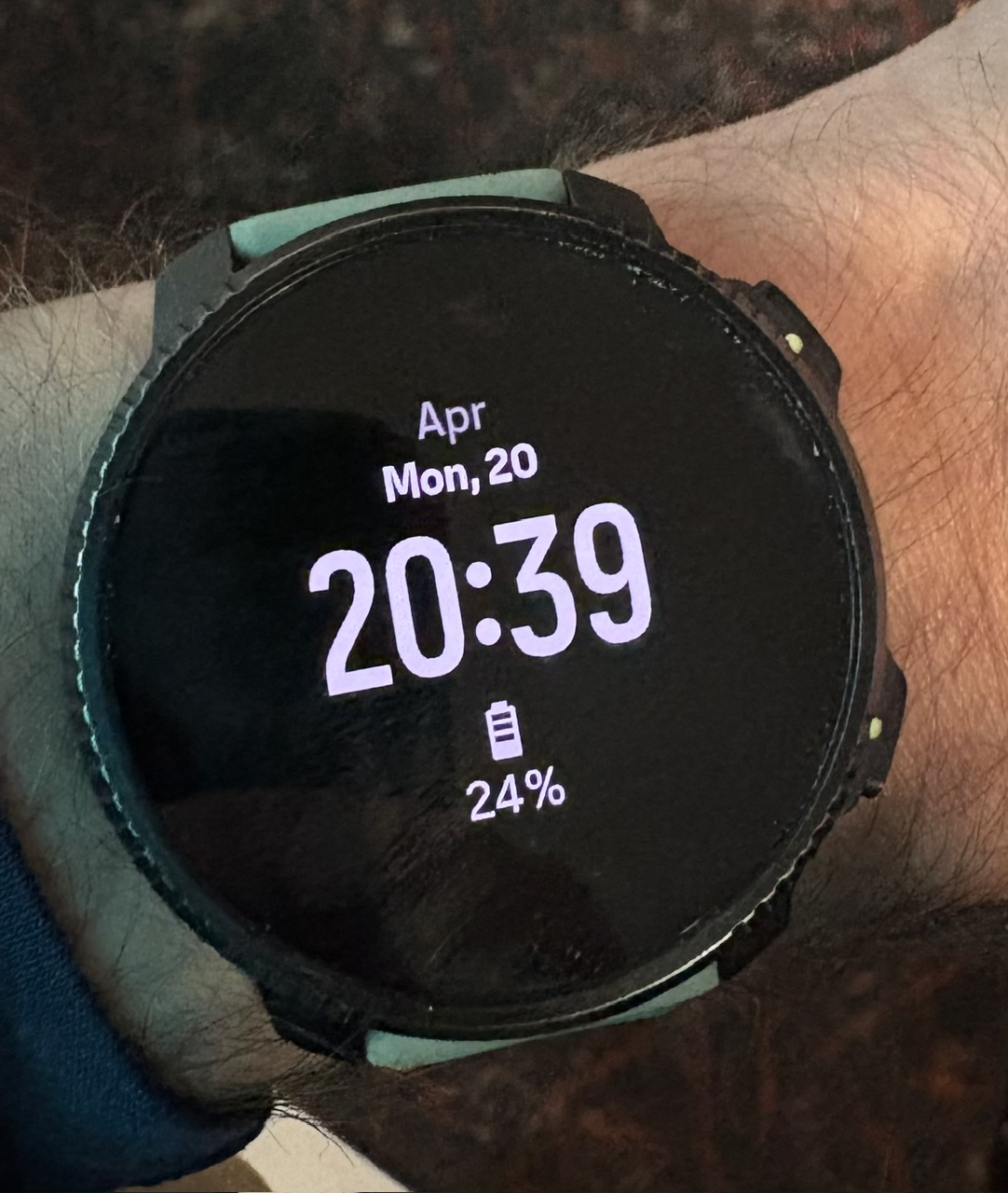
t6, S6, Elementum Terra, Ambit 3 Sapphire, Spartan Ultra Copper, Traverse Alpha, S7 Graphite LE, S9B Ambassador, S9P Titanium, S9PP Titanium, Vertical All Black, Race Titanium Charcoal, Race S Titanium Courtney, Run Lime, Race 2, Vertical 2 Titanium
-
@Egika is the Outdoor watchface on Vertical 2 different than on Race 2? Or is this a mockup?
-
@OutdoorMan said in Minimal watchface (feedback):
is the Outdoor watchface on Vertical 2 different than on Race 2? Or is this a mockup?
Why do you think it would be different? Does it look different on your Race 2 when you try it?
“Outdoor” is nice, but I need seconds.
Race S
-
@Squirrel different than in the above picture
-
@OutdoorMan I don’t think so.
This is the active display.t6, S6, Elementum Terra, Ambit 3 Sapphire, Spartan Ultra Copper, Traverse Alpha, S7 Graphite LE, S9B Ambassador, S9P Titanium, S9PP Titanium, Vertical All Black, Race Titanium Charcoal, Race S Titanium Courtney, Run Lime, Race 2, Vertical 2 Titanium
-
@Egika thank you so much! Outdoor is also very good. Very similar to Ocean.
-
Interesting. Never even occurred to me that different watchfaces would incur different amounts of battery power and drain
-
@OutdoorMan said in Minimal watchface (feedback):
different than in the above picture
Press the crown.
Race S
-
@Egika got it, thanks.
-
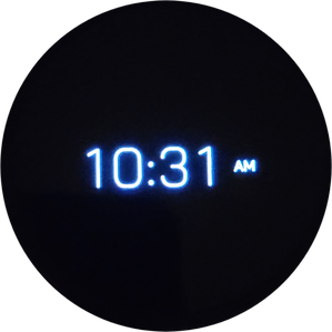
@Squirrel I realized it’s not the time only screen, was too tired yesterday I guess.
-
@Squirrel Ocean has seconds. I think the fonts are better too. It’s almost perfect but as there’s an outer complication, once removed, you notice that fonts are smaller than they should.
I also miss the light grey font color configurable for both complications and main fonts to make the watchface more battery efficient and less intrusive while you are at home.
Hello! It looks like you're interested in this conversation, but you don't have an account yet.
Getting fed up of having to scroll through the same posts each visit? When you register for an account, you'll always come back to exactly where you were before, and choose to be notified of new replies (either via email, or push notification). You'll also be able to save bookmarks and upvote posts to show your appreciation to other community members.
With your input, this post could be even better 💗
Register Login