Watch Faces - we need new
-
@Lukasz-Domiza hate to say it but as an Apple Watch Ultra 2 user I find the Apple Watch faces awful. I just tend to stay with the Ultra faces as the rest are boring and dull. I find my Race Watch faces extremely useful and aesthetically pleasing. Each to their own I guess.
-
@Jeffrey-Tillack
I use “monoedge” and “stride” suits for the office, and “athletes” for sports and outdoor activities. No one has replaced them. -
@maszop Legibility should be a very high priority unless they think their demographic is mainly 20-30 year olds with great vision?
-
For the record, I think the Race 2 and Vertical 2 faces are very good, I’d like to see more development in terms of options for those two.
For example being able to configure the Race 2 graph to show us sleep over time, or HRV, or CTL, or cycle through all three if you tap on it.
The same with the Vertical 2, make the bottom complication configurable too!
Oh and larger complication fonts
")
-
the watch face I needed

Vertical 2 v2.53.42
-
@runomatic The Christmas watch faces look like my 7-year-old daughter painted them.
 🤮
🤮Suunto Baro Ambassador Edition
Suunto Vertikal
Suunto Race
Suunto Race 2
Suunto Wing 2 -
@Manuel-Extreme exactly the look of my watch right now. Same band as well. Haha. Like @Cyclepunk says: it does look like a child’s picture. Still like it. A collegue asked me: do you have painted it yourself?
I do like it
-
@Cyclepunk luckily we can choose - don’t like it, don’t use it
")
@Manuel-Extreme I am using the same right now -
@Horizontal_2 I love it! With the AOD option, it’s a must-have these days

-
@Manuel-Extreme Yeah, the AOD-style is quite nice as well. Whished that for more watch faces. I’d easily trade a 1% per day extra for a better AOD-version. It’s the one you’ll see most of the time. Maybe they could add some contourlines to the default watch face (AOD) of the V2.
Maybe it’s a watch face idea: a coniferous or deciduous watch face
-
@Cyclepunk it depends on what you expect, if you want to have photorealistic tree with lights emulated by raytracing
than yes this is really bad watch face, but i think lot of people like its simpicity, even AOD version is elegant and minimalistic.I hope infuture suunto would open API for general public to develop own watch faces. It would allow to satisfy everyones needs.
-
@Tomas5 Suunto has released an update for the Race (1) or the Run where you can add a picture as a watch face, right? That’s a start
-
@Horizontal_2 that can be interesting
-
@Horizontal_2 only for the RUN at the Moment
-
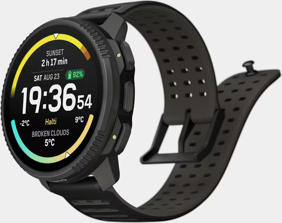
Just to throw a thought in here, as a (newly minted) Run user: the barometer field needs some help. In Imperial units (which I as American have a love hate relationship with) it shows to the ones place for inHg—literally useless information because it would be the equivalent of showing only to the hundreds place hPa! And whats worse, the barometer trendline (far more useful, and a staple of suunto watches across decades of product lines) isn’t an option at all, despite showing up in the preview (alongside value, in the same field) for “Concentric Analog”. Not sure if that could be fixed faster since it applies uniformly to all existing watchfaces, but man alive is it annoying…
As for needing new designs, I agree with many on this thread that have pointed out a lot of the designs work quite well, and a lot of it comes down to taste. However, as the OP pointed out, there’s some very minor tweaks that could help tremendously, including functional changes like my above noted barometer problem…
-
I agree,
we need new watch faces, or the existing ones need to be much more flexible and adaptable. We would need much more variables where you can simply define whether you want something or not, or in a different representation. -
@vinc14 i imagine that now when there is kind of “store” with watchfaces in suunto app and we can choose one to install to watch. There must be some universal API that this watch faces are using. I hope one day suunto will open it to public, provide some tools to develop them. Than comunity can handle it and provide hundreds of watchfaces.
I know some will say that bad watch face can cause problems, battery drain, crashes maybe. But proper API would prevent 99% of priblems. And than still suunto can allow to users to publish comunity watchfaces with some tag that is comunity watch face and state that comunity watch faces are not covered by warranty and customer support.
And i hope same for Suunto Plus apps.
-
Sorry to disagree, I don’t need new watch faces.
More specifically, I prefer that Suunto developers focus on developing new functionalities and bugfixes in watch/app.
If they release a SDK so 3rd party people could develop new watchfaces, I will be happy to use new ones… but since only Suunto devs can do them, I will prefer they focus on new functionalities/bugfixes
BR
Ion -
@suzzlo totaly agree with this. For me current watch faces are enough, but i would like to try develop own if it was possible.
Hello! It looks like you're interested in this conversation, but you don't have an account yet.
Getting fed up of having to scroll through the same posts each visit? When you register for an account, you'll always come back to exactly where you were before, and choose to be notified of new replies (either via email, or push notification). You'll also be able to save bookmarks and upvote posts to show your appreciation to other community members.
With your input, this post could be even better 💗
Register Login